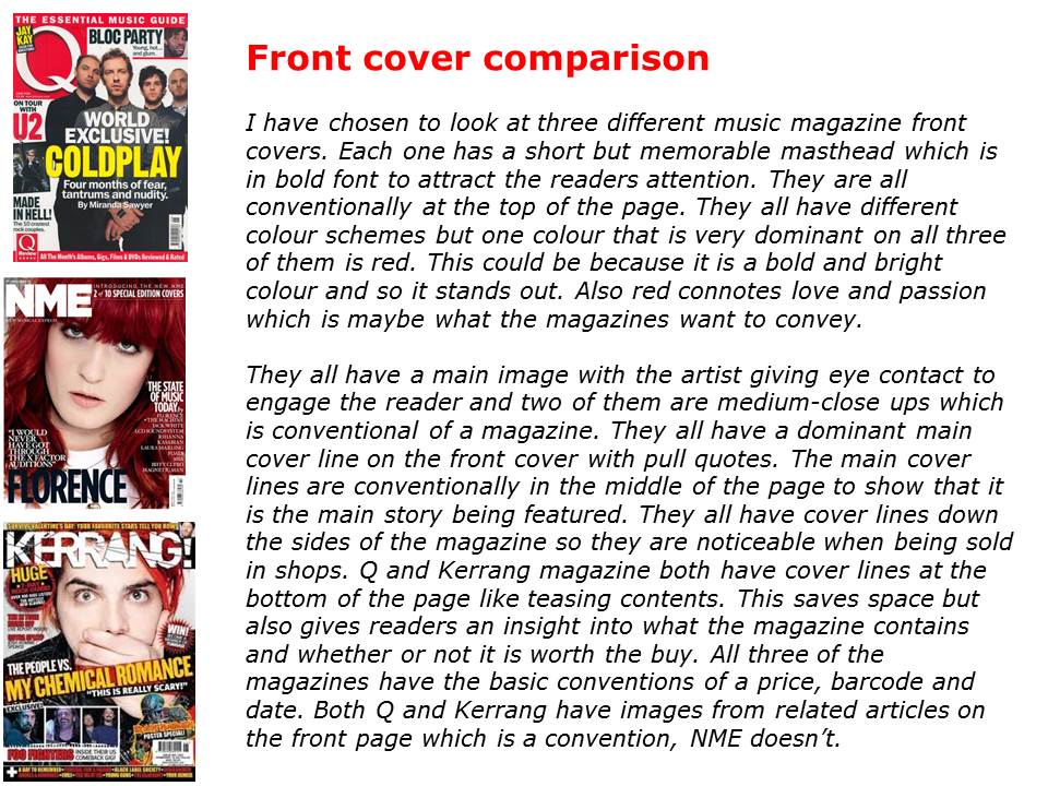
These are my comparisons of front covers, contents pages and double-page spreads. I compared all the common conventions that are featured, the colour schemes, feature stories, layout etc. I found out that each magazine has its own style which i need to incorporate in my own magazine. They all have a house style colour scheme which follows through the whole magazine, the colour scheme also fits in with the genre of the magazine and has given me ideas on my own colour scheme. The main images on all front covers are very strong so i need to make sure mine is. After comparing contents pages i know the kind of layout that i want and that i need to include a 'features' section and a 'regulars' section. I also need to know that i need to include other images from related articles to give it more depth. After comparing the double-page spreads it gave me inspiration for what to do for my own layout and story. Also that i should include a 'pull quote' from the article. Comparing three magazines for all three pages has been very useful and has given me inspiration and ideas for when it comes to doing my own magazine.


No comments:
Post a Comment