
Saturday, 22 December 2012
Friday, 21 December 2012
Final front cover draft

This is my final front cover draft. I chose a colour scheme that fits in well with my chosen genre of alternative rock/indie (black, red and white) Also the red makes the front cover stand out well as it contrasts nicely with the other colours. I used auto on my image to make it brighter and more defined. My masthead is conventionally at the top of the page and i think the name reflects the font as it is quite 'fuzzy'. After the feedback, i got told that my plug needed to be yellow and smaller so the text runs over it. I have the basic conventions of the date and price underneath the masthead but i think it needed to make them smaller. I have a barcode at the bottom right corner but again i think i needed to make it a little bit smaller. I have teasing contents at the bottom of my front page which i like as after researching other magazines i have noticed that others have them too and it gives readers an insight into what other artists are featured.
Monday, 17 December 2012
Front cover draft 4

Front cover draft 3

Front cover draft 2

Front cover draft 1

Sunday, 16 December 2012


Saturday, 15 December 2012
Mindmap of ideas using prezi
This is my midmap of ideas using prezi. It goes through step by step of all my ideas for my music magazine. First i looked at possible name ideas and came up with some that i though fit my chosen genre of music. My next point was thinking of different colour schemes for my magazine as every magazine needs a house style and continuous colour scheme that fits in with their genre of music. I then though about what artists i like and what ones will be on my front cover feature stories. After looking at other music magazines and what articles are featured i thought about some possible ones for my own. Ones that will get the audience interested and intrigued but also ones that feature artists who my target audience will like.
Font ideas
After thinking of ideas for the name of my magazine i have decided on 'FUSION'. I think it sounds as if it is related to my chosen genre of indie/alternative rock and it has the meaning of indie and alternative rock being fused together as my magazine aims to include both genres of artists. I researched different types of fonts for my name of my magazine and these were the fonts that rteally stood out to me and seemed unique:


Monday, 10 December 2012

Sunday, 9 December 2012
1st Box plot draft - Front cover

Friday, 7 December 2012
Existing behind the scene photoshoots of music artists
These are videos of existing behind the scene photoshoots. I researched into these to give me inspiration for my own photoshoot that i will be doing. It inspired me to try out different poses and positions aswell what angles look good and to be unique. Also it showed me what lighting looks good for when it comes to doing my own photoshoot.
Behind the scenes of Gwen Stefani's UK ELLE photoshoot:
Florence Welch behind the scenes photoshoot for Bazaar magazine:
Thursday, 6 December 2012
Costume and make-up ideas

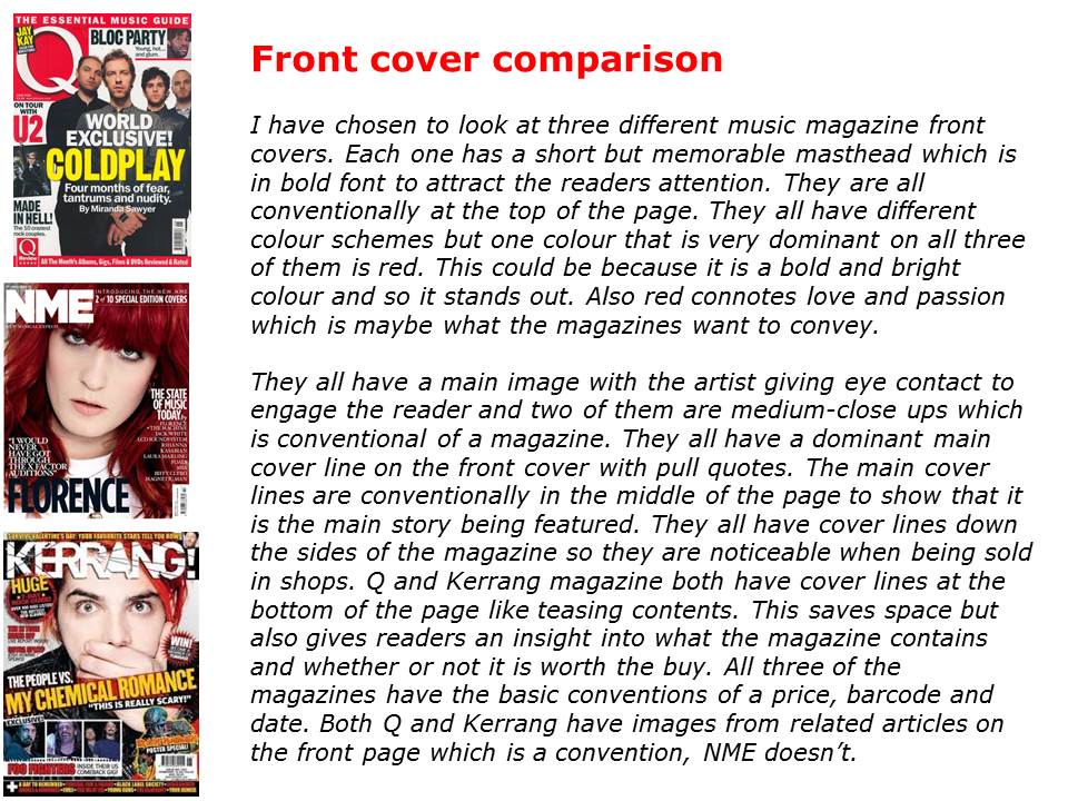
Front cover, contents page and double page-spread comparison


Saturday, 1 December 2012
My Reader Profile

Friday, 30 November 2012

Thursday, 29 November 2012
Top 40 Download Chart
1. Trouble Maker - Olly Murs
2. Little Thins - One Direction
3. Beneath your beautiful - Labyrinth
4. Something New - Girls Aloud
5. Girl On Fire - Alicia Keys
6. Gangnam Style - PSY
7. Candy - Robby Williams
8. The Power of Love - Gabrielle Aplin
9. Ho Hey - Lumineers
10. Locked Out Of Heaven - Bruno Mars
11. DNA - Little Mix
12. Diamonds - Rihanna
13. A Thousand Years - Christina Perri
14. Dont You Worry Child - Swedish House Mafia
15. Not Giving In - Rudimental
16. Can You Hear Me - Wiley
17. Skyfall - Adele
18. Sweet Nothing - Calvin Harris
19. One More Night - Maroon 5
20. Latch - Disclosure
21. Hall Of Fame - Script ALTERNATIVE ROCK
22. Shine Ya Light - Rita Ora
23. Give Me Love - Ed Sheeran
24. Beauty and Beat - Justin Beiber
25. We Are Never Ever Ever Getting Back Together - Taylor Swift
26. Tidal Wave - Sub-Focus
27. Back In Black - AC/DC HARD ROCK
28. Anything Could Happen - Ellie Goulding
29. Try - Pink POP ROCK
30. I Found You - Wanted
31. Love Is Easy - McFly POP ROCK
32. I Cry - Flo Rida
33. Va Va Voom - Nick Minaj
34. Live While We're Young - One Direction
35. Wings - Little Mix
36. Right Now - Rihanna
37. Wonder - Naughty Boy
38. Do You Think Of Me - Misha B
39. Gold Dust - DJ Fresh
40. Highway To Hell - AC/DC HARD ROCK
This is the top 40 download chart at the moment. As you can see there arent many of them that are in my chosen genre of indie/rock. The nearest to it would probably be 'Hall Of Fame' by the Script. This is good in the sense that i can do my magazine to make indie rock more popular and well known. A lot of the artists on this list are pop and R&B which is very popular at the moment on the charts so if i can make a magazine based on indie rock it will hopefully make it more popular and encourage people to listen to it.
Tuesday, 27 November 2012


Monday, 26 November 2012


Sunday, 25 November 2012

Monday, 19 November 2012
Focus group
We had to do a focus group task where we ask each other questions regarding music magazines. The answers that were gave will help me to develop the price and my overall product, such as whether i am going to include a free gift.
One of the questions that was asked was 'how much would you expect to pay for a music magazine?' The feedback given was she would pay anywhere up to £2,50 for a weekly magazine and up to £4.00 for a monthly one. This helped me think of the price for my magazine.
Another question asked was 'how often would you want it to be published'? The feedback was if it was to get quick updates on artists etc then it should be weekly.
We also asked whether free gifts would persuade you to buy the magzine and the answers was that it would and these included free posters.
Focus group planning
These are the questions that we asked each other in our focus group in order to get some ideas on what to include in our magazine:
- Do you buy magazines, if so how often?
- What makes a music magazine appealing?
- How much would you be willing to pay for one?
- How much would you want it to be published?
- What would encourage you to buy a magazine?
- Do competitions in magazines make you want to buy it more?
- What free things do you want to be included?
- What type of music do you like?
Friday, 16 November 2012
Practice photoshoot


Friday, 9 November 2012

Wednesday, 7 November 2012
Moodboard

Sunday, 4 November 2012

Saturday, 3 November 2012

Genre
I have chosen to have my music magazines main genre as Alternative/Indie. These are bands such as 'The Kooks' and 'Linkin Park'. I have chosen this genre of music because this is one of the main genres that i listen to and love. Existing magazines that are this type of genre are ones such as 'NME' and 'Q' magazine.
The Kooks -
Florence and the machine -
Linkin Park -
Coldplay -
The Kooks -
Florence and the machine -
Linkin Park -
Coldplay -
The Brief
The music magazine task is to produce a front cover, contents page and double page spread of a music magazine. The images and text must be produced by you and there must be a minimum of four images.
Monday, 15 October 2012
Evaluation

For my media preliminary task I had to come up with a college magazine front cover and a draft of a contents page. I chose to do magazine front cover that is aimed at both male and female students and so when I came up with my sell lines I didn’t stick to particular articles. For example I did one about becoming a doctor which can be aimed at both male and females. My main cover line was about life after college which is what a lot of students will be interested in and will want to find more about. To make my magazine appeal to more people and persuade them to read it I added a special offer of a free revision guide and timetable. When people automatically read the word ‘free’ they are drawn to it and so this will attract more readers.
I placed the
masthead conventionally at the top of the page in simple, bold font. That way
it is the first thing the audience will see and they know what the magazine is
about. I also added a black outline to the masthead so it makes it stand out
even more. I stuck to a simple of colour
scheme of red and different shades of blues as I didn’t want it to look over
crowded. I chose red because it stands out the most and also it connotes
happiness and joy which puts a positive representation on the college.
I took the
photo of the model myself against a background of lockers. I was going to use
this photo as the whole image but I thought there wouldn’t be enough colour so
I decided to put the model against a background of a library. That way it shows
more aspects of the college more. I found it tricky when using the magnetic
lasso tool to crop the model out as if I made a mistake I would have to start
again from the beginning. Once I had finished cropping I put her on the
background of the library and tweaked the edges making it smoother. I placed
her conventionally in the middle of the front cover. The model is smiling which connotes that she
is happy to be in college and she is also wearing casual clothing connoting
that college is a laid-back and relaxing environment. I wanted her to hold
folders so that it reinforces the idea of college life and makes her look more
like a student. I used the clone tool on the models face so it gave her face
more of a clear complexion and made it a little lighter. The background of the
library was a little bit dull so I increased the brightness of it as well as
the contrast to add a bit more colour. The conventions of a magazine front
cover include a barcode and so I added one to the left third of the magazine. I
resized it so it was smaller and rotated it to go on its side.
If I were to do this project again there are some things that I would do differently. I would try and be more imaginative when thinking of sell lines, more which relate to specific courses. That way I know that the target audience would be more varied as I would try and do an article to relate to all types of people. I would also take the pictures that I needed in portrait as I took them in landscape and so they wouldn’t fit properly into Photoshop.
I think my front cover has a positive representation of the college as the model is clearly smiling showing that she is enjoying college and she is wearing causal clothing connoting a relaxing and chilled environment. I want the readers to believe that college is an independent workplace but also a happy and welcoming place to learn. I added a subtitle underneath the masthead in blue font which contrasts well against the red masthead making it stand out more. It says ‘student guide to life at college’ This I think will let the readers know that it is an informative magazine aimed directly at students and so it will attract more people who need to know about what life is like at college.
By Rosie
Thompson


Sunday, 14 October 2012


Saturday, 13 October 2012

Subscribe to:
Comments (Atom)