Saturday, 15 December 2012

Font ideas

After thinking of ideas for the name of my magazine i have decided on 'FUSION'. I think it sounds as if it is related to my chosen genre of indie/alternative rock and it has the meaning of indie and alternative rock being fused together as my magazine aims to include both genres of artists. I researched different types of fonts for my name of my magazine and these were the fonts that rteally stood out to me and seemed unique:

Sunday, 9 December 2012

1st Box plot draft - Front cover


This is my first draft of a front cover, this is just a rough idea and so is not my final one.

Friday, 7 December 2012

Existing behind the scene photoshoots of music artists

 
These are videos of existing behind the scene photoshoots. I researched into these to give me inspiration for my own photoshoot that i will be doing. It inspired me to try out different poses and positions aswell what angles look good and to be unique. Also it showed me what lighting looks good for when it comes to doing my own photoshoot.
 
 
Behind the scenes of Gwen Stefani's UK ELLE photoshoot:


Florence Welch behind the scenes photoshoot for Bazaar magazine:
 

Thursday, 6 December 2012

Costume and make-up ideas


This is my costume and make-up ideas for my photoshoot. I want my model to be wearing a black simple dress and either red doc martens or black biker boots. This i believe fits in with my genre of indie/rock because its not too girly it is a simple look but looks quite indie. I liked the pose at the top right corner as it is a longshot and would be a good photo for my double page-spread. I wanted the make-up to be simple and fresh but with a tint on the lips so it didnt look boring or understated. I have included  converse and skinny jeans into my ideas as this fits in with my genre also and are very popular amongst my target audience of 15-24. For my contents page i want my models to be wearing skinny jeans and converse. I have included a guitar for one of my props because i think i want one of my images on my contents page to involve a guitar to give my iimages variation.

Front cover, contents page and double page-spread comparison
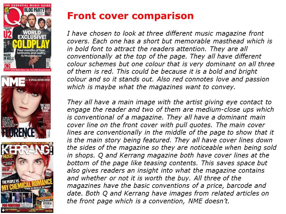


These are my comparisons of front covers, contents pages and double-page spreads. I compared all the common conventions that are featured, the colour schemes, feature stories, layout etc. I found out that each magazine has its own style which i need to incorporate in my own magazine. They all have a house style colour scheme which follows through the whole magazine, the colour scheme also fits in with the genre of the magazine and has given me ideas on my own colour scheme. The main images on all front covers are very strong so i need to make sure mine is. After comparing contents pages i know the kind of layout that i want and that i need to include a 'features' section and a 'regulars' section. I also need to know that i need to include other images from related articles to give it more depth. After comparing the double-page spreads it gave me inspiration for what to do for my own layout and story. Also that i should include a 'pull quote' from the article. Comparing three magazines for all three pages has been very useful and has given me inspiration and ideas for when it comes to doing my own magazine.


Saturday, 1 December 2012

My Reader Profile

This is my own reader profile that i have created after looking at NME's reader profile. After identifying that my targer audience will be 15-24 i chose images that are aimed at this age range. The images also link in with my magazine genre of alternative rock/indie. For example, people in my magazines age range wear a lot of converses and doc martins but also people who enjoy indie and alternative rock music. I have included the price and frequency of my magazine to make it informative.