For my media preliminary task I had to come up with a college magazine front cover and a draft of a contents page. I chose to do magazine front cover that is aimed at both male and female students and so when I came up with my sell lines I didn’t stick to particular articles. For example I did one about becoming a doctor which can be aimed at both male and females. My main cover line was about life after college which is what a lot of students will be interested in and will want to find more about. To make my magazine appeal to more people and persuade them to read it I added a special offer of a free revision guide and timetable. When people automatically read the word ‘free’ they are drawn to it and so this will attract more readers.
I placed the
masthead conventionally at the top of the page in simple, bold font. That way
it is the first thing the audience will see and they know what the magazine is
about. I also added a black outline to the masthead so it makes it stand out
even more. I stuck to a simple of colour
scheme of red and different shades of blues as I didn’t want it to look over
crowded. I chose red because it stands out the most and also it connotes
happiness and joy which puts a positive representation on the college.
I took the
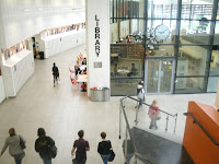
photo of the model myself against a background of lockers. I was going to use
this photo as the whole image but I thought there wouldn’t be enough colour so
I decided to put the model against a background of a library. That way it shows
more aspects of the college more. I found it tricky when using the magnetic
lasso tool to crop the model out as if I made a mistake I would have to start
again from the beginning. Once I had finished cropping I put her on the
background of the library and tweaked the edges making it smoother. I placed
her conventionally in the middle of the front cover. The model is smiling which connotes that she
is happy to be in college and she is also wearing casual clothing connoting
that college is a laid-back and relaxing environment. I wanted her to hold
folders so that it reinforces the idea of college life and makes her look more
like a student. I used the clone tool on the models face so it gave her face
more of a clear complexion and made it a little lighter. The background of the
library was a little bit dull so I increased the brightness of it as well as
the contrast to add a bit more colour. The conventions of a magazine front
cover include a barcode and so I added one to the left third of the magazine. I
resized it so it was smaller and rotated it to go on its side.
If I were to do this project again there are some things that I would do differently. I would try and be more imaginative when thinking of sell lines, more which relate to specific courses. That way I know that the target audience would be more varied as I would try and do an article to relate to all types of people. I would also take the pictures that I needed in portrait as I took them in landscape and so they wouldn’t fit properly into Photoshop.
I think my front cover has a positive representation of the college as the model is clearly smiling showing that she is enjoying college and she is wearing causal clothing connoting a relaxing and chilled environment. I want the readers to believe that college is an independent workplace but also a happy and welcoming place to learn. I added a subtitle underneath the masthead in blue font which contrasts well against the red masthead making it stand out more. It says ‘student guide to life at college’ This I think will let the readers know that it is an informative magazine aimed directly at students and so it will attract more people who need to know about what life is like at college.
By Rosie
Thompson


